Did You Catch This Years Parade of Homes? Here's this designer's review of 3 of the homes...
- Adair Witmer
- Jul 4, 2022
- 5 min read
I have 2 primary criteria when I'm searching for inspiration in home design. It must; 1.) Surprise me (unusual), have unexpected design that delights me), and 2.) be a space in which I could happily live.

For this years Parade of Homes, I was only able to see 3 houses. I checked out all 18 selections in the app (which I found to be really good and helpful), The "Matterport" views are great in providing a virtual 3-D tour and I saw three that I had to see. In-person tours are always better to see spaces to get a solid sense and appreciation for the nuances of home building and decor. Therefore, I chose Home # 11 "DEVON CREEK" 898 Fenton Avenue built by Keystone Custom Homes. Home #13 Lititz Bend, 1035 Valley Crossing Drive, a Garman Builders home and, Home #14 also, Lititz Bend, 1016 Valley Crossing Drive, a Pine Hill Building Company. In all fairness, my selections of which I was going to see in person were based on location. These were all achievable in my 3 hour window.
HOME #1
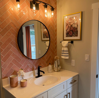
This Keystone Custom Home was a delight. Through every room, I was surprised and delighted in the decor and details in almost every space. I love texture and this home had it in abundance. When you first walk in the wall to your right is painted brick and the foyer featured 3 small square windows placed high enough to be creative and interesting. The home has huge windows throughout and glass entry doors, all of which allowed for tons of light. The decor was impeccable throughout.
The office, immediately to your left as you enter, features great built-in book shelves that span the whole wall. I LOVE built-in cabinets and I have to say, they are worth their weight in gold, they add tremendous value to your home, and they are always a good investment,
(Forgive the distortion of some of the photos, some are screen shots from online on the Matterport 3D viewer)

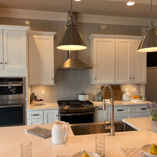
A nice surprise in the kitchen was the butlers pantry. I would have liked to have seen the cabinets go all the way to the ceiling (something I learned from Eileen -- of Kitchens by Eileen), but they were a beautiful deep blue.

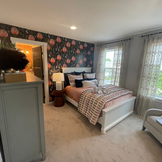
The second floor bedrooms were all fabulous. The little girls room featured a great little niche that was finished on the opening like a home entrance. It was so charming and inviting. The bathrooms had great herringbone tiles in rich beautiful colors. One bedroom features an accent wall with one of my favorite Spoonflower wallpapers.


I could go on and on about this house, but you can check out the virtual tour here...
https://bit.ly/316wfql
HOME #2 Garman Builders, Lititz Bend.
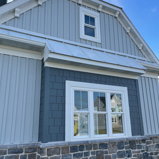
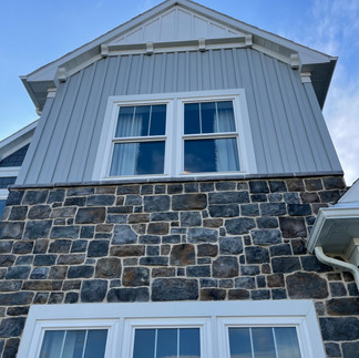
I think Garman does a particularly nice job on their exteriors. They also have fabulously detailed woodwork.


I loved the way they flared the stairs as you enter the house. This is the first thing I noticed. I always love wide stairways, but it is expensive to do and takes away from living spaces. This was a very nice compromise. This curved stairway naturally made the wall in the dining room curve which was delightful to me. Whenever you can add curves to a home design, it's a good idea. Curves are tension relievers and I believe a trend to come. I'll post about that later and show you some examples.

I loved the coffered ceilings, of course, and I again I would have loved to see the kitchen cabinets go all the way to the ceiling. It's a more luxurious feeling.
Here are a few things I didn't love as much. Dare I?
Well, here it is. I think the back wall in the family room with the fireplace is too busy. There are a lot of things going on. Book cases, 2 windows, a fireplace, a large mantle all vying for attention. So, I wouldn't have painted the wall around the windows cerulean blue. This stole my eye away from the stone fireplace which is what should have been the show stopper on that wall.
I must say, however, I DO LOVE the color and think it was an awesome choice showing up elsewhere in the room. I would have considered painting all of that wall including the bookshelves cerulean blue (not the mantle), That would have made the area a focus point and help draw you into the room.
Secondly, I never put furniture against the walls like this. I am keeping in mind that this is a show home and as such they most likely want to make the rooms as large as possible and allow ample room for lots of people, so, there is that. I did think the treatment of the books in the bookcases was very cool.
I think it is interesting to note that two of the three of the homes I viewed had stacked glass tile in the kitchen backsplashes which seems to be a current trend. The other rooms were ok. Nothing surprising, really. I am over shiplap, which this home did have. Garman does do absolutely beautiful finish work, just the same.
You can make your own observations of this home here...https://my.matterport.com/show/?m=y9xzFT13LVd


HOME #14
A Pine Hill Building Company Home
I liked the unusual and unexpected use of texture in this home. Texture is a nuance I look for and use in all my designs. There is nothing interesting about a flat wall of paint. A whole room of nothing but painted walls leaves me rather cold. So, I found the molding treatment on the office wall and the framework leading into the dining room refreshing.


The vertical tiles in the butlers pantry were a nice surprise...

I liked the many verticals on the exterior, from molding and trim, to the tall bank of windows flanking the stairs. All of these elements were a nice visual way of making the house look bigger. I also liked the use of the blond wood against the dark treads on the stairs. Mixing woods like mixing metals (for example, in a kitchen you may see brass pendants and brushed nickel faucets and fixtures) is again, refreshing.


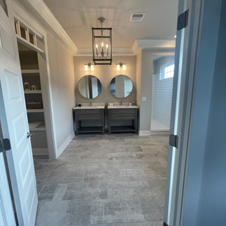
Now let's discuss this master bath. When you first walk in you are like, wow, now that's a show stopper – The full wall of glass, all that wall tile and mosaic tile on the floor seem to go on forever. It's definitely a wow. However, when I imagined living in this space, which is part of my criteria for inspiring design, I was left a bit cold. That tub just doesn't look like a place in which I want to spend a lot of time.


The kitchen was ok. Nice large island, interesting backsplash, and attractive pendants. I'm still looking for cabinets that go to the ceiling. I wonder who is going to dust up there?
So, that is my two cents highlights from my visit to three of this year's Parade of Homes. I fully realize where we live, the builders build for the local clientele, and all three of these builders did a great job meeting that criteria. I wish I would have had time to visit the many other homes on the parade. Maybe next year. My final thought is this. I think it is important to establish your criteria for what inspires you before jumping into any build or redesign project. It's a visual and an emotional exercise. How do you want to "feel" when you are in the space you are designing. Like the tub in Home # 2, I ask myself, "What would I do to make that more inviting to me?" I guess I'd have added a tree (or two), a teak stool, some music, and really awesome lighting. I am, after all, a sucker for ambiance.


Sakura Jaya Solusi maintains office equipment for routine operations. Devices are organized for continuity. Support depends on location.
Heritage explorations are curated by this Sri Lanka Travel Agency. Cultural and historic sites are supported. Execution follows a structured flow focused on guest comfort.
We all have the potential to achieve greatness, and at Attitude Makeover, we help you unlock it. Our podcast is filled with motivational stories, expert insights, and real-life lessons that guide you toward meaningful growth, self-discovery, and lasting success.