IDEAS FOR USING COLOR IN HOME DECOR
- Adair Witmer
- Jul 25, 2019
- 2 min read
COLOR! Use it! Embrace it! Don't be Afraid of it!

There are three things that I use to create "ambiance" – lighting, texture, and of course, color
Everyone loves color, but are very often afraid of just how to use it to bring a bland room to life. It's a common affliction so I thought I'd share some of my thoughts and approaches.


Ever been in a room that seemed to be "all over the place?"
You enter a room and you may not even be aware of it, but your eye darts all over the place...it is actually looking for a resting spot. What typically happens is that there is not a dominant color being used to ground the decor.
There is a solution.
But first, where to begin to establish a color palette?
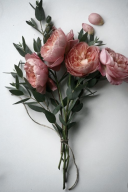
I often use a rug to establish color schemes. The sample below is a color board I put together for a couple whose kitchen I am redesigning. This is the palette I used for the adjoining living room. We were opening up walls, so the nearby rooms play an important role in keeping the whole space feeling pulled together.
Make adjoining rooms flow using your color palette.
In this example the client had found a nice grey color cabinet she liked (the image on the left, below) but was having a difficult time figuring out how the grey cabinets would work in their home which had predominantly warm tones (Brick Reds, Golden Yellows, etc.) My suggestion was to use a green grey cabinet. The rule here is that the colors will work if they have the same 'undertones'. In this case the green grey we selected has a yellow undertone, which works with her existing decor. The original grey cabinets from her inspiration photo, while very lovely, have a blue undertone so you can see the conflict.

A helpful tip on balancing color schemes

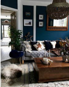
There is a helpful rule when you are deciding on how to use your color, It's the 60 / 30 / 10 rule. 60% of your room should be your predominant color, 30% an accent color, and 10% your second accent color.
The room above pretty much follows this rule with the room decor predominately (60%) blue/grey tones, the orange/rust being roughly 30% of the decor and lastly the green (with the greenery) is 10%.
Check out this link explaining the approach. https://bit.ly/2UltCYE


If you have questions about how you can add color, create your own color palette for your home or would like to schedule a design consultation conversation, call or email me. I'd love to chat!
Adair
717-278-3900
adair@ambiancebyadair.com


Comments